01
The Challenge
Hannah Lipschutz is a seasoned copywriter who wanted to cement her elevated positioning. She needed visual branding that gave prospects the message: “I’m an authority. I’m professional. You can count on me,”

02
The Zinque Solution
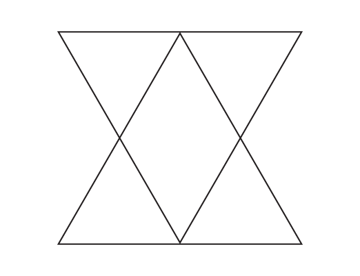
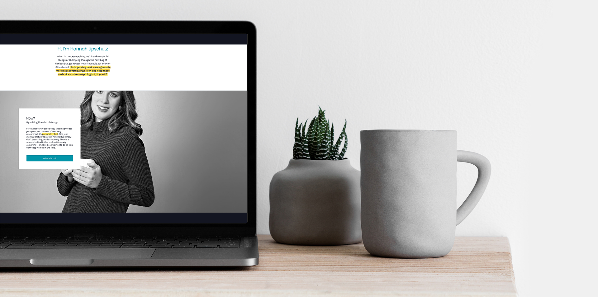
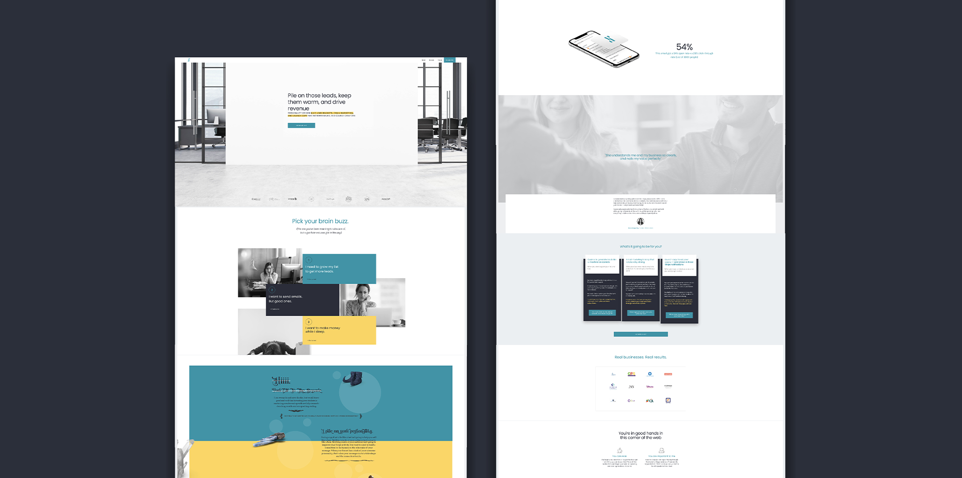
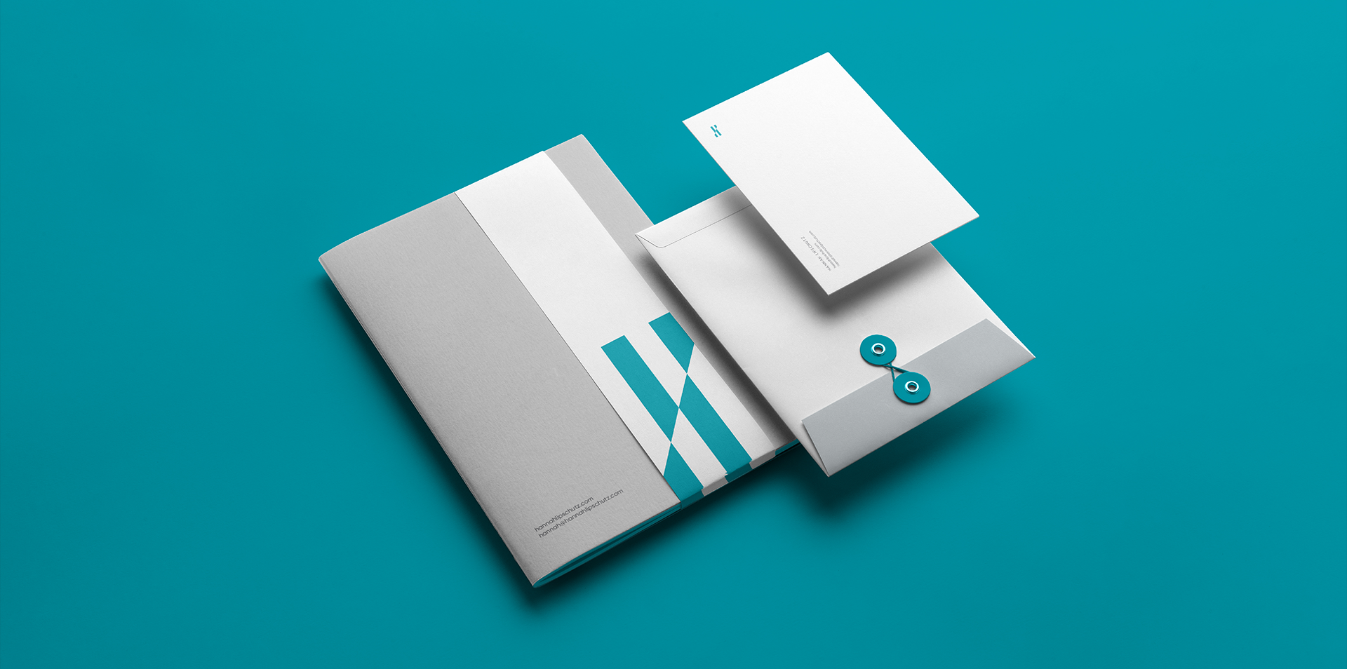
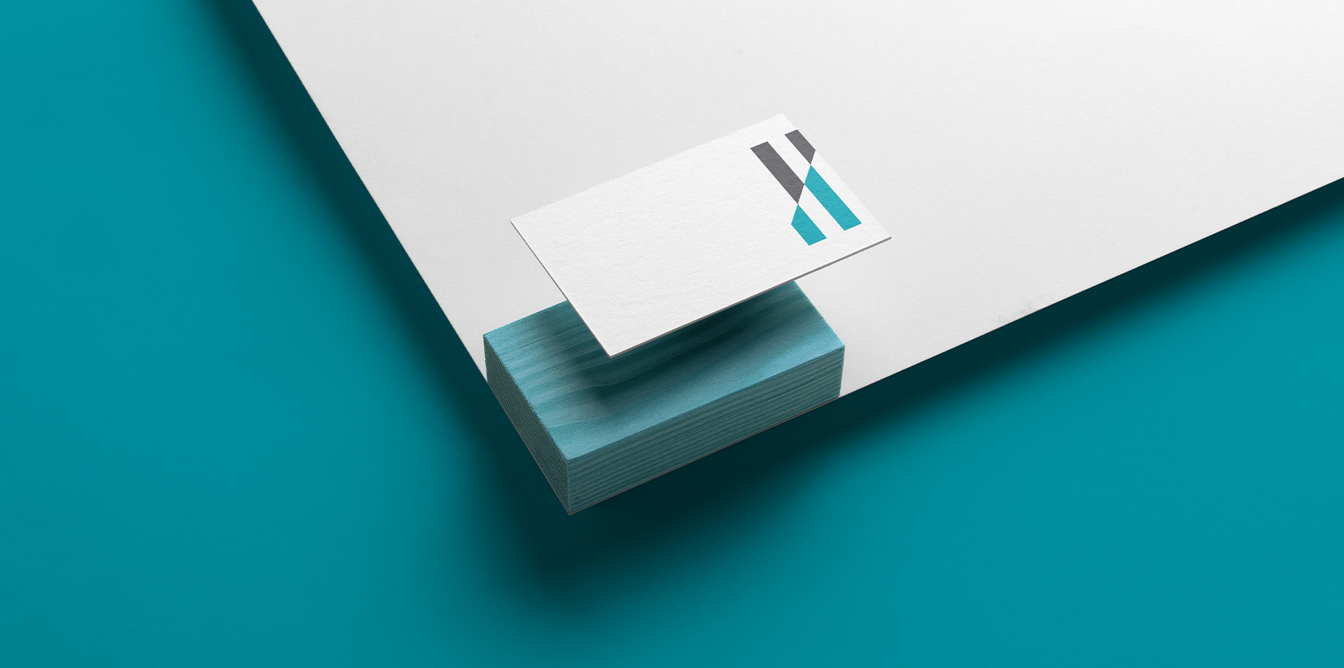
The logo is an abstracted depiction of the letter “H,” comprised of modern parallel lines, combined with a dynamic sense of movement. For the website, we focused on the theme of power and authority. Generous amounts of white space combined with a bold, minimalist color palette communicate strength and confidence.
03
The Result
A powerful, striking visual identity broadcasts that Hannah is an expert in her field. Her clients know at a glance they can rely on her from beginning to end.
