CASE STUDY 2: SOIREE


Upscale events,
packaged to impress

Soiree,
Party in a Box, USA

Throwing a lavish, themed home event has never been an easier, or more beautiful, option. Soiree puts together every detail and customers get an all-encompassing, glamorous experience, wrapped up and delivered straight to their door. Soiree came to us before they launched for marketing direction and design. Since this was an absolutely innovative concept, our challenge was to create a visual identity that would attract serious attention, stopping people in their tracks.

Soiree combines glamor and convenience, and their creative needed to communicate both. On one hand, customers enjoy a stunning party that will impress their guests down to the finest detail. On the other hand, working with Soiree is light, easy, and hassle-free. It’s not too high-end or far-reaching. We wanted to demonstrate instantaneously that this was the new way to throw a deluxe party. This was the solution.

Brand mining
& discovery

After extensive research and discovery, we zeroed in on Soiree’s three most prominent brand attributes: Elegance, convenience, and creativity. We created a moodboard for each, incorporating lots of contrast and a realistic three-dimensional feel, allowing the viewer to experientially get a taste of what’s being offered.

01

Elegance

Soiree delivers real dishes, glasses, and quality tablewares for each party — nothing about the event feels cheap.

02

Convenience

Perfect events come packaged and delivered to customers’ doors. They never have to leave the comfort of their home. It’s as simple as it sounds!

03

Creativity

Soiree events are thought out to the end. Every detail and party favor is beautiful, high-quality, and theme-supporting.
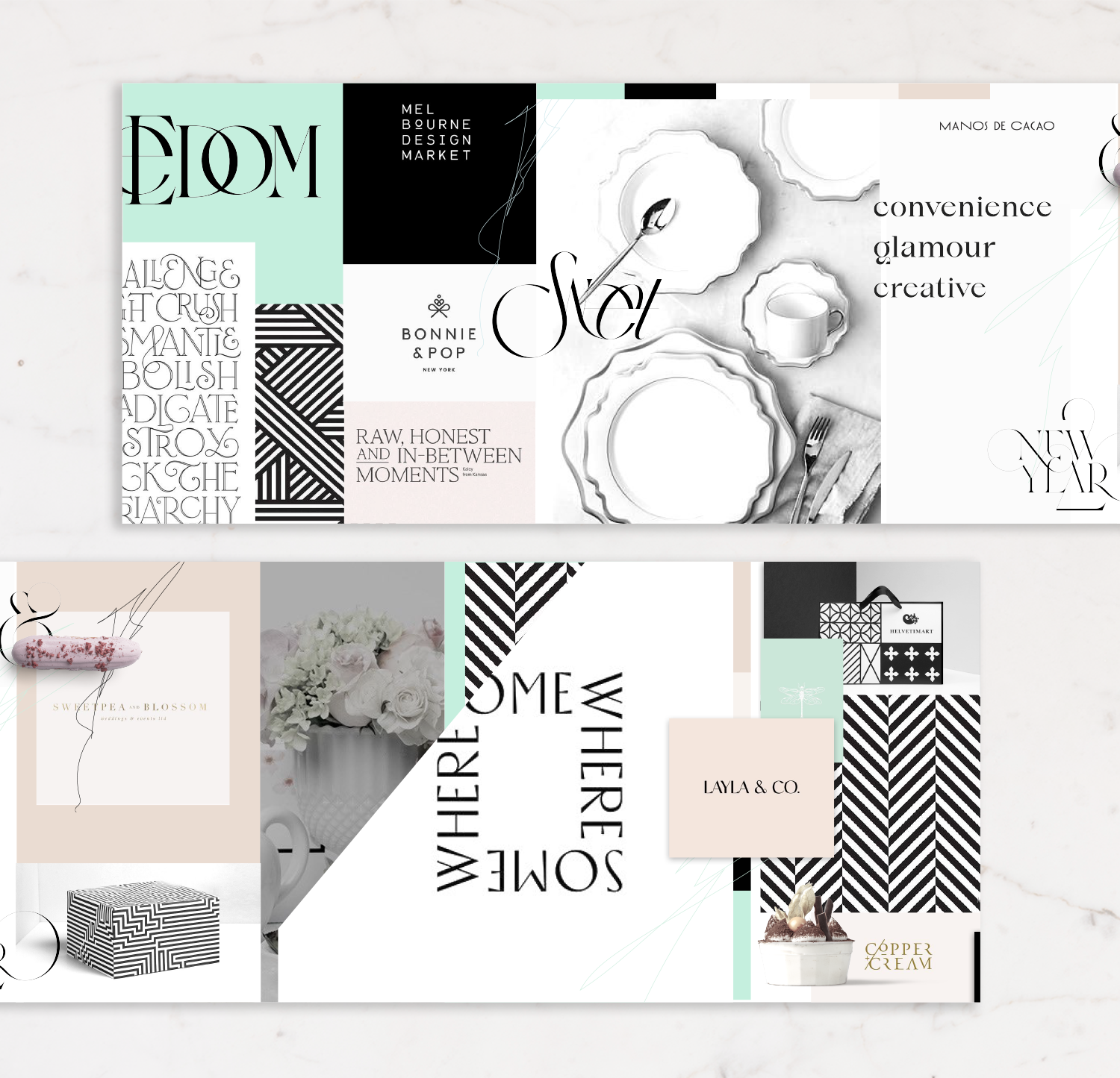
Moodboards

The final moodboard incorporated elements of all three, but stayed away from excessive twirls and swirls. The client preferred to emphasize the sleek, modern tone.

Color palette

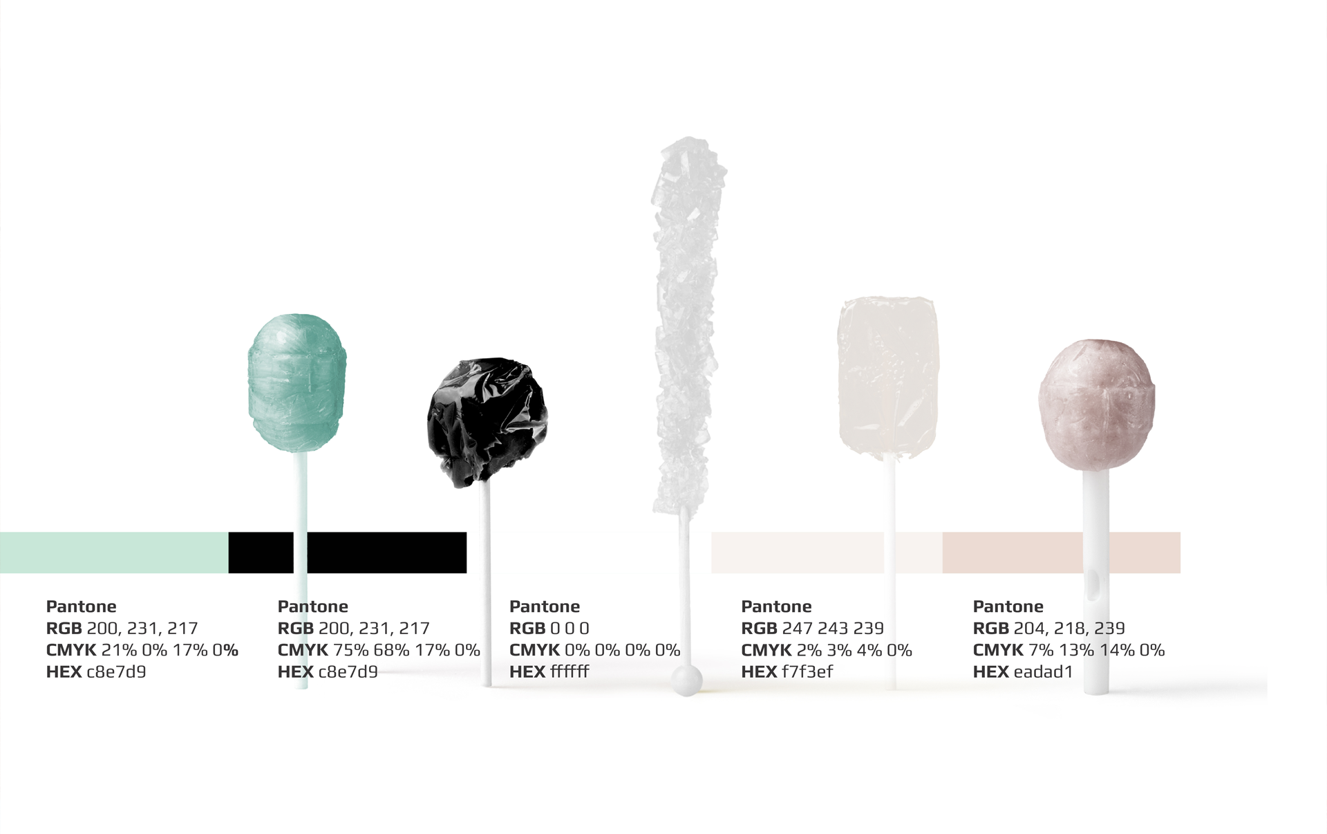
Our challenge regarding color was to find a palette that worked well with all party themes, from sleek and sophisticated to traditional. It had to have energy that would work in a print ad as well as digital.

To achieve this, we maintained the high-contrast look but instead of stark black and white, opted for black and a very subtle pink. This light pink is neutral enough to work well with a versatile array of color schemes, and at the same communicates exclusivity. We accented these with hints of turquoise and a darker version of the pale pink — to be used only for standalone visuals.

The end result was coloring subtle enough to work with multiple party themes, but bold enough to attract attention.
Typeface

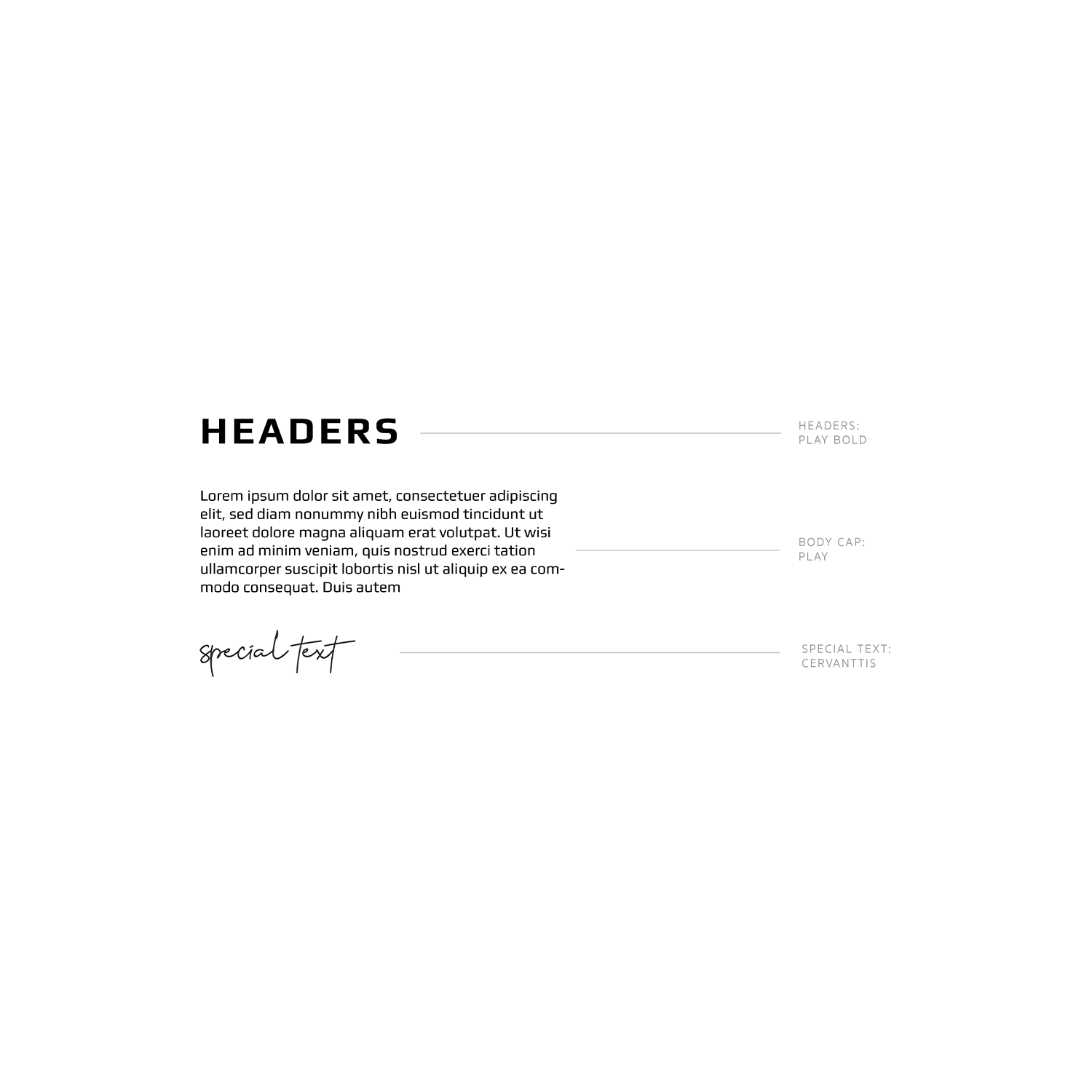
The typeface was a strong sans serif font, looking bold and strong, attractive and luxurious. The bold, thin letters are modern and playful, but certainly convey high-end.

Logo

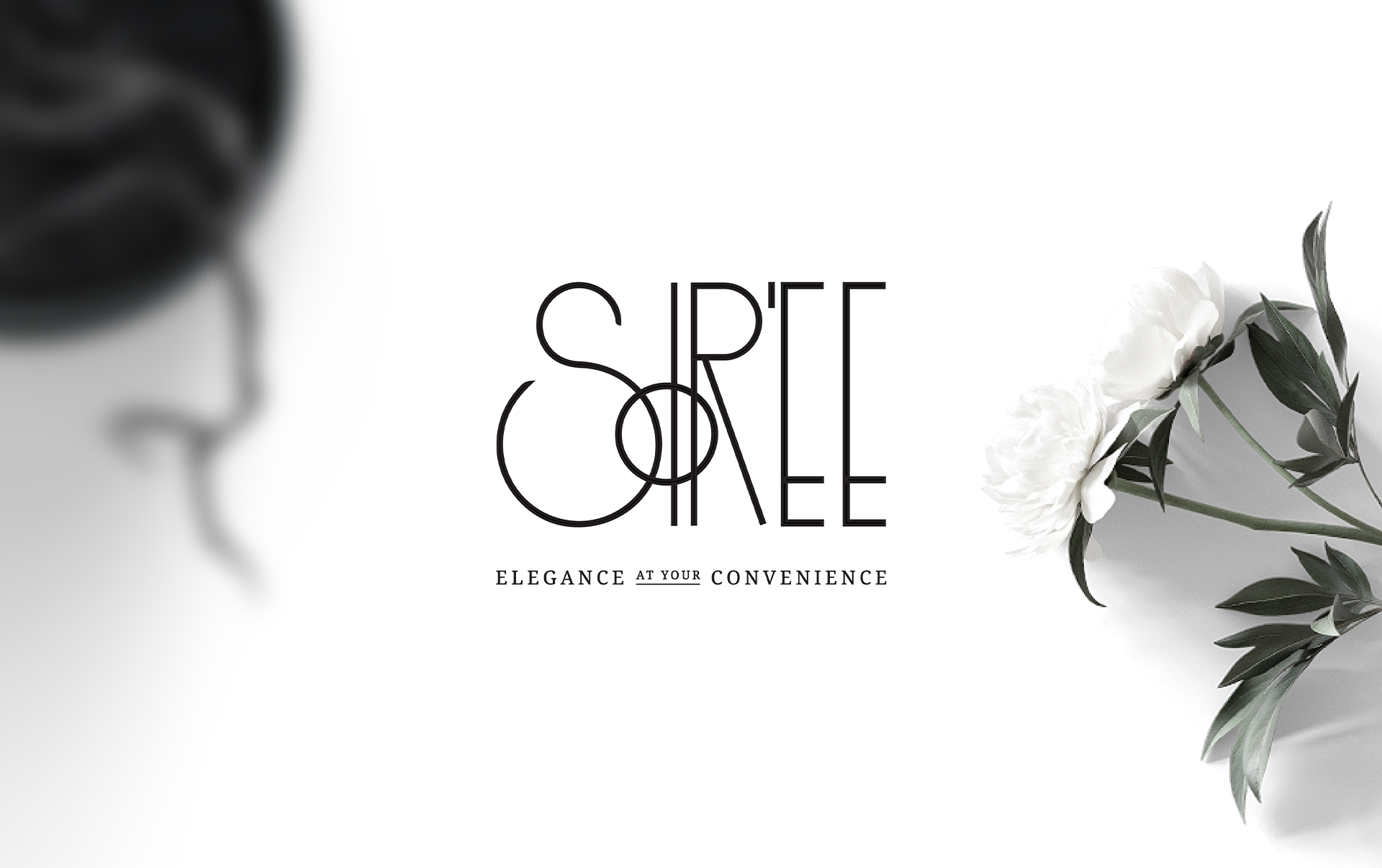
The logo we created was party-like and sophisticated, yet approachable and friendly. The playful use of overlapping lines and different font sizes say modern, fun, and cool. The rectangular shape visually recalls a tablescape, and the small “o” calls to mind the moon, symbolizing evening — the “soir” of “soriee.” There is fantastic contrast between hard and soft, edgy and warm, bold and inviting.

Packaging

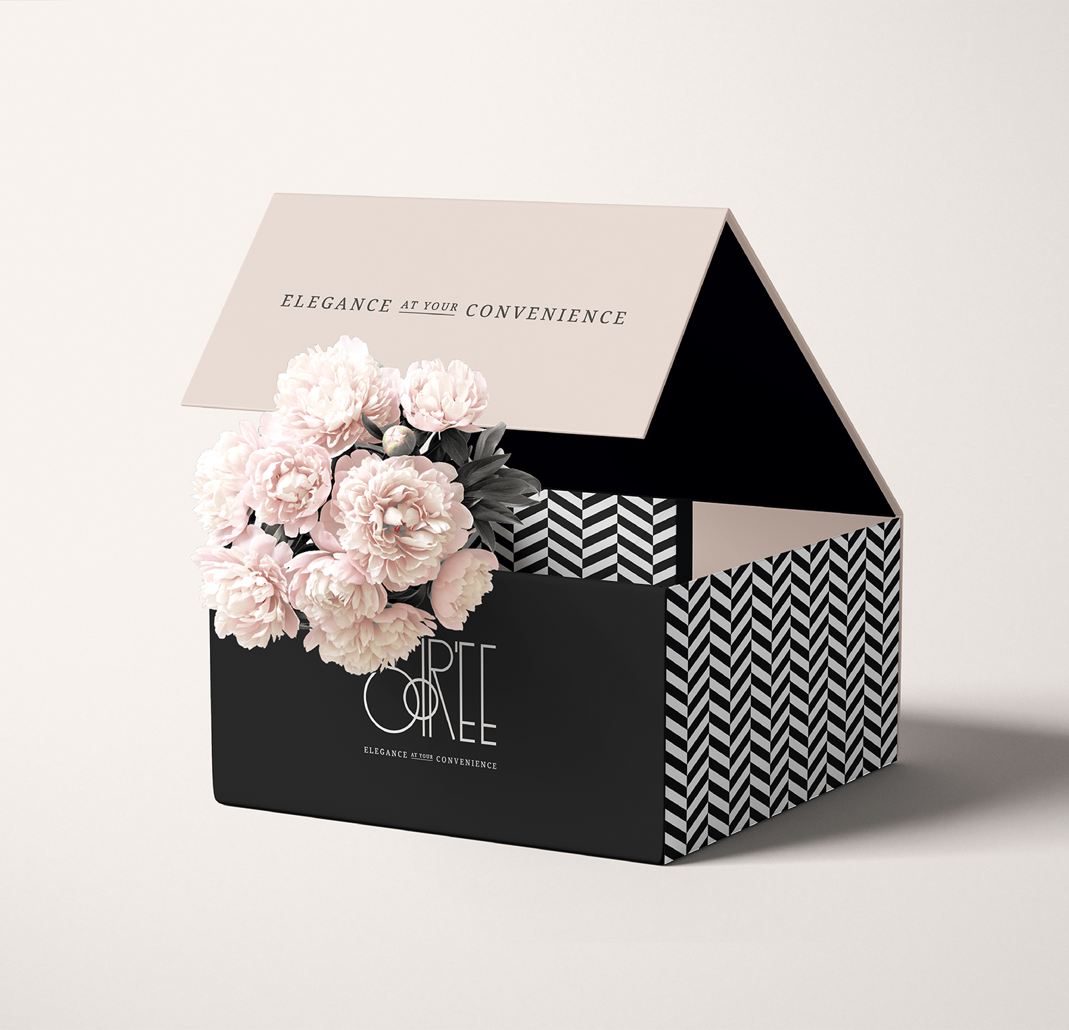
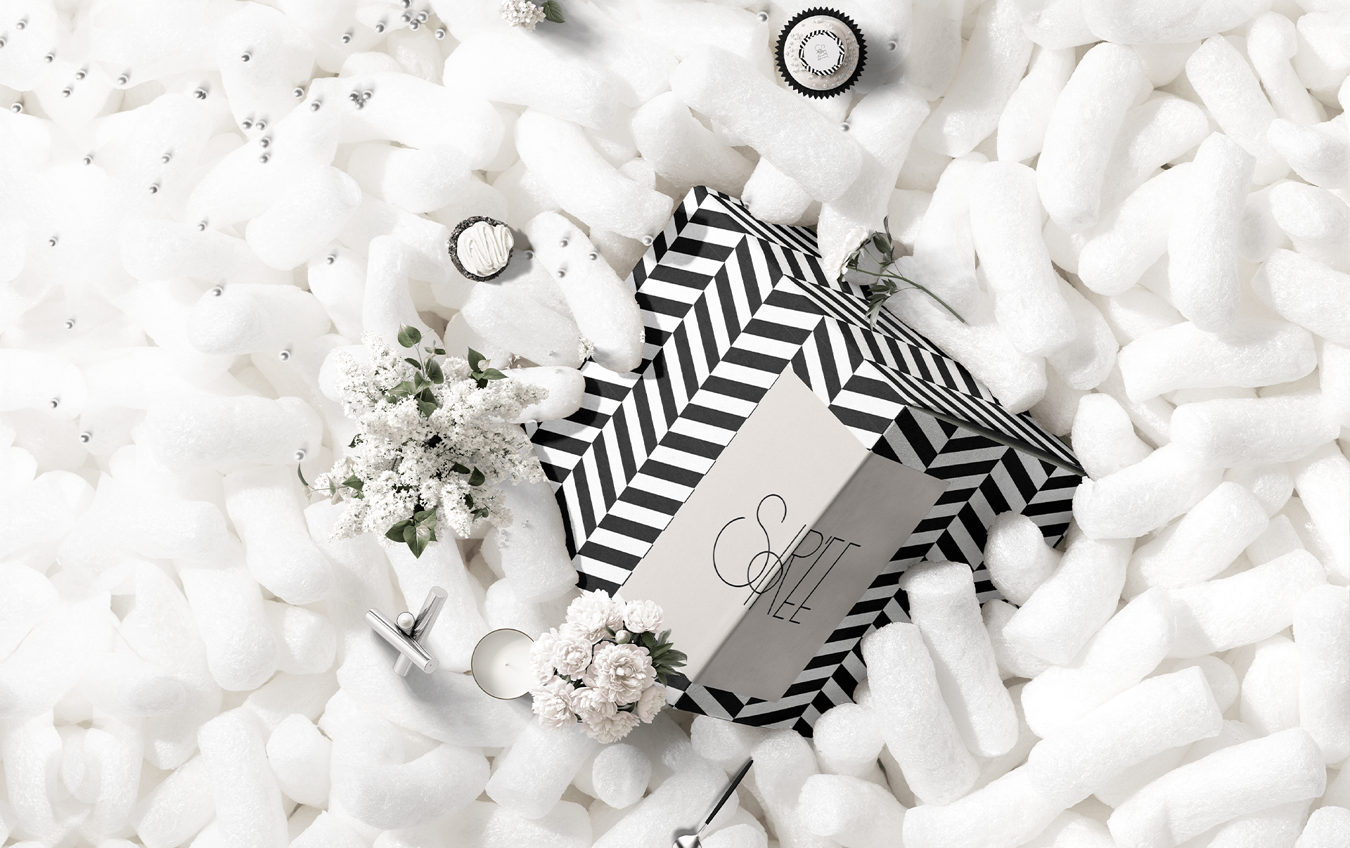
As the first thing that customers would see, the box presentation and packaging needed to be beautiful with stunning bows, fashionable tags, and decorative stickers. But at the same time, it needed to be practical, transportable, and functional. The party was the star of the show here — the pretty exterior played a supporting role.

Print ad

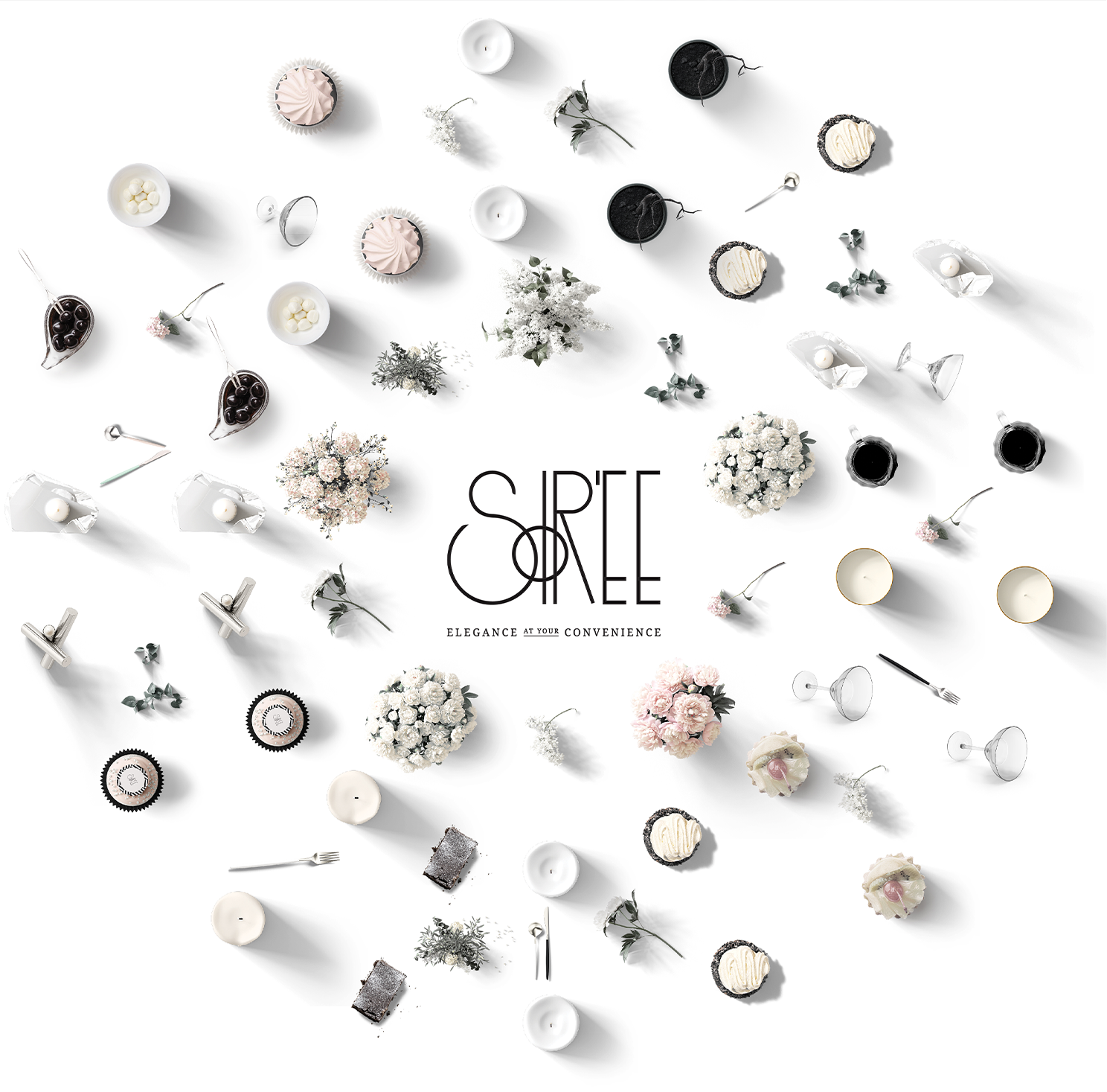
For the print ad, we created Soiree’s signature three-dimensional look — a birds-eye view of a table with branded circles and rings that seem as though they’re coming off the page. (This was later adapted to the client’s Instagram feed, maintaining the same expansive, off-the-screen experience.)

Every element was branded to perfection, with twenty-one drafts of the coloring alone! When the ad went to print and the color did not display accurately, we took it upon ourselves to communicate directly with the magazine, ensuring our client’s satisfaction.
Instagram feature
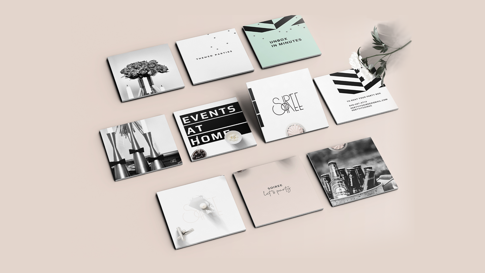
Next, we tackled Instagram, presenting the client’s entire branding in feed form. We created a new visual of a branded three-dimensional box and flowers, and then guided the client regarding optimal post scheduling and organization. The client was delighted with the results, and thrilled she could use many of her own photos.

Digital ad & catalogue

The digital ad we created for Soiree stayed true to the brand vocabulary we had already solidified, but with added dynamic elements. We used the circles from the print ads but instead of keeping them static, we set them in motion, so they were turning around. The client added a raffle incentive for engaging with the post and voila — the campaign was hugely successful.
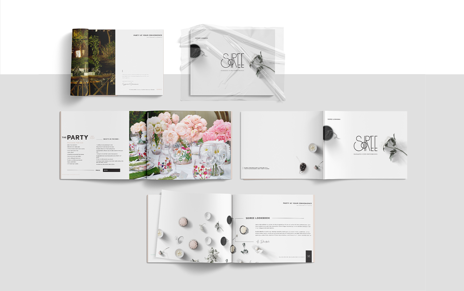
We created a beautiful catalogue which did full justice to Soiree’s jaw-dropping service. The coloring stayed extremely subtle in order to let the visuals shine, but it still brought the branding to light in a powerful way. The result is a clear, visually appealing, and easy to read catalogue that attracts customers and brings in sales.

The happy ending

Soiree is now an original and unique brand, with a visual marketing that hits their audience in all the right places.
TESTIMONIAL

“Blown away by the design — and the talent”

“Working with Malky was amazing! I had approached other designers, but no one offered the in-depth branding she did — just logos and ads. The presentation I got was next level. I was blown away by both the design and the talent. Everything looked beautiful and every last detail reached absolute perfection. Malky was a pleasure to work with, too. She was pleasant and easygoing, even when there were extra revisions to make. The whole thing was such a wonderful experience. I got exactly what I wanted, and more. I highly recommend working with Malky.”

— Hindy Deutsch, CEO, Soiree

Your visual
identity awaits

Your visual
identity awaits

Loading...