01
The Challenge

02
The Zinque Solution
03
The Result
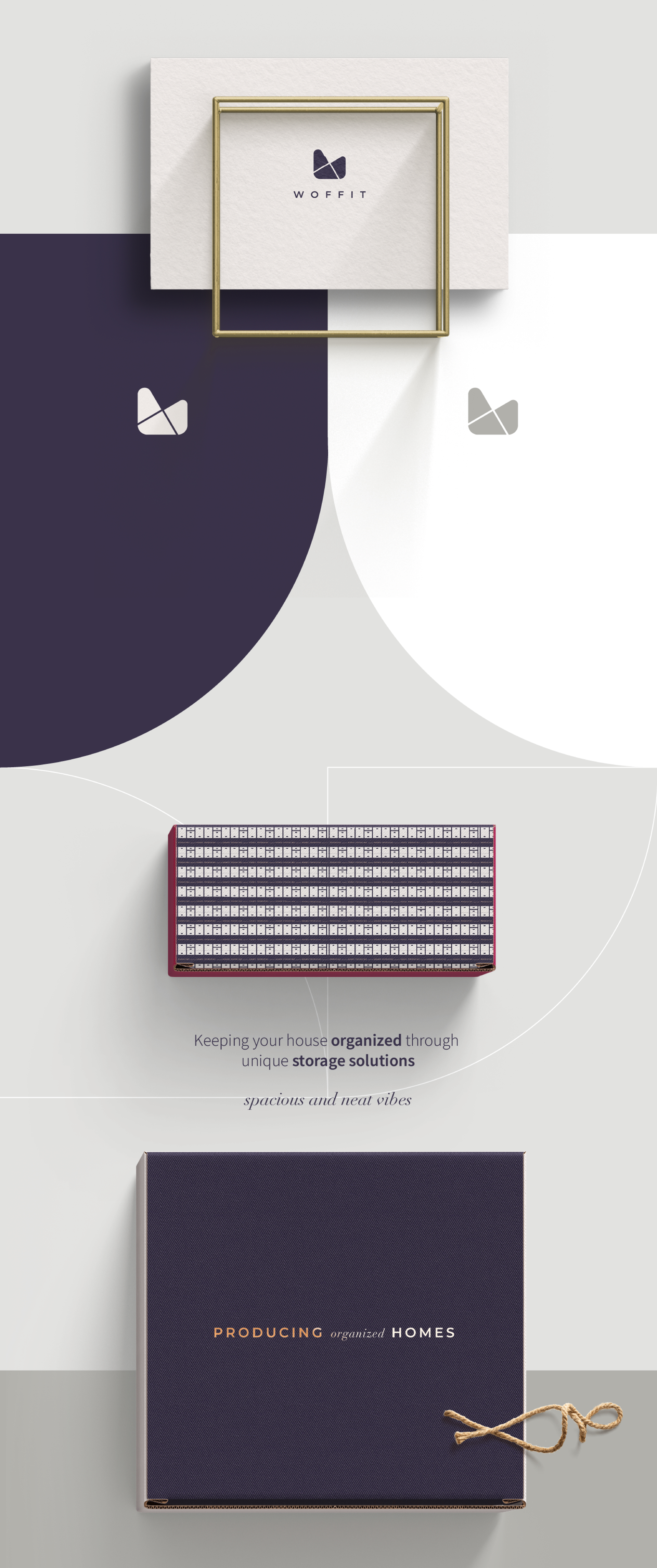
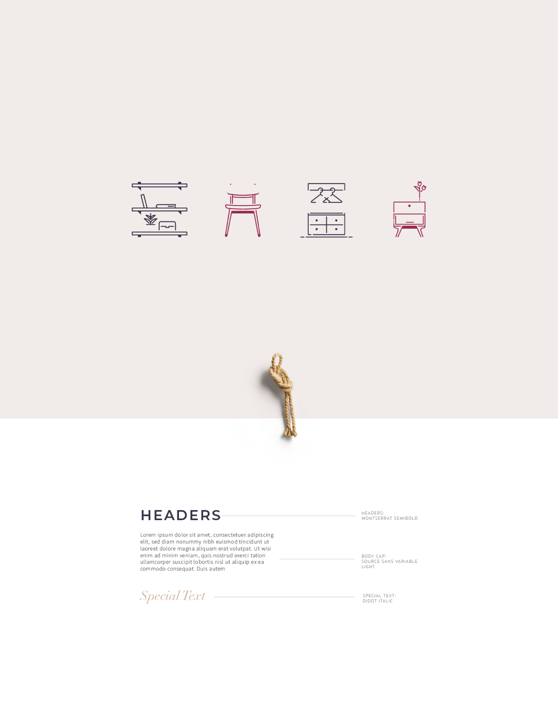
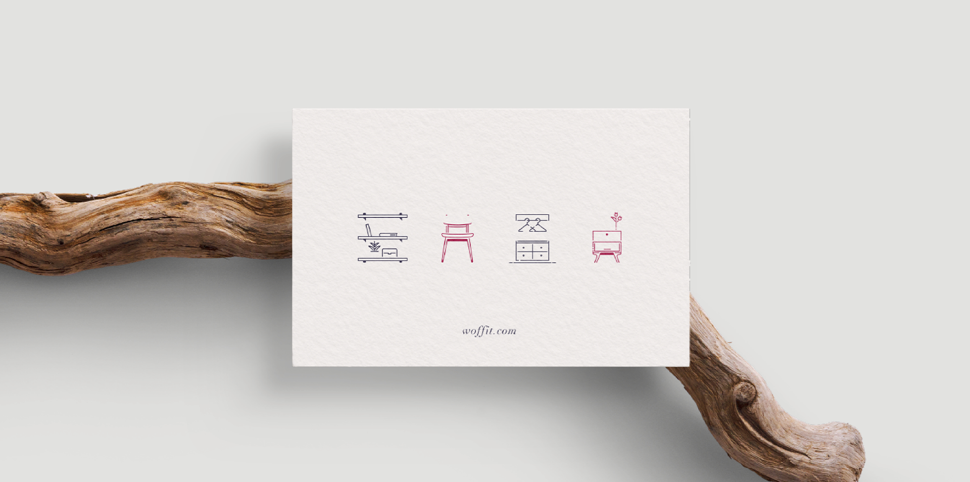
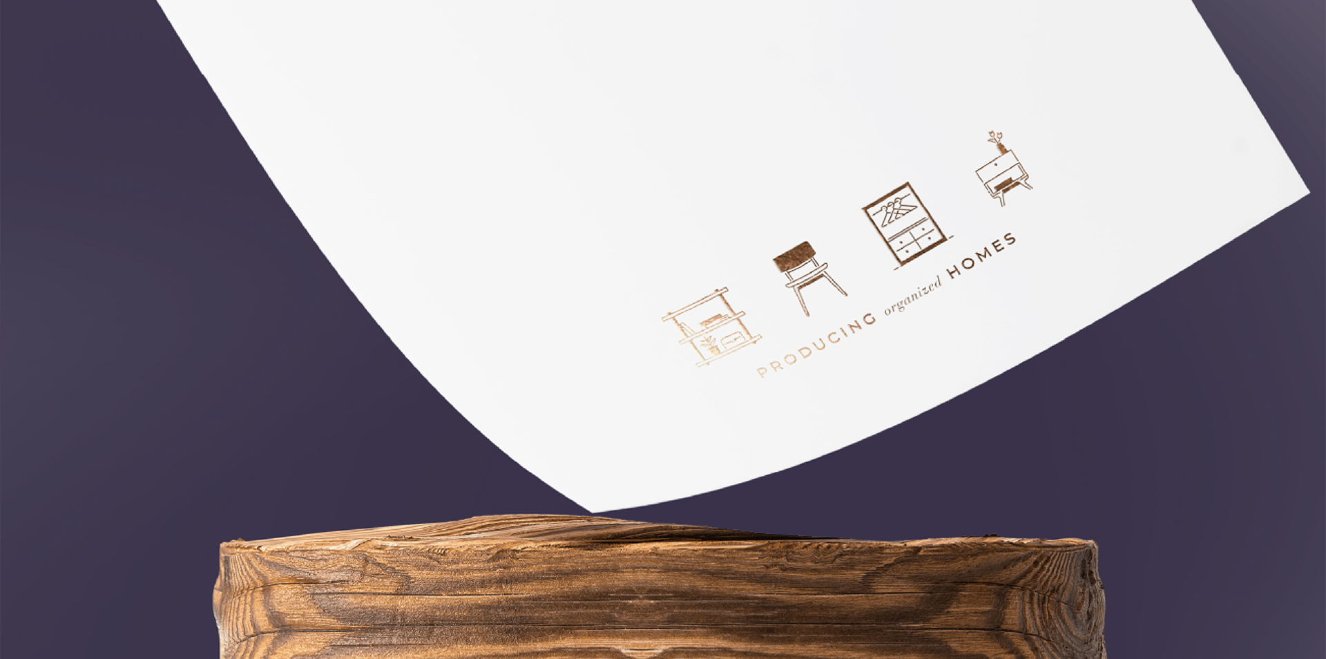
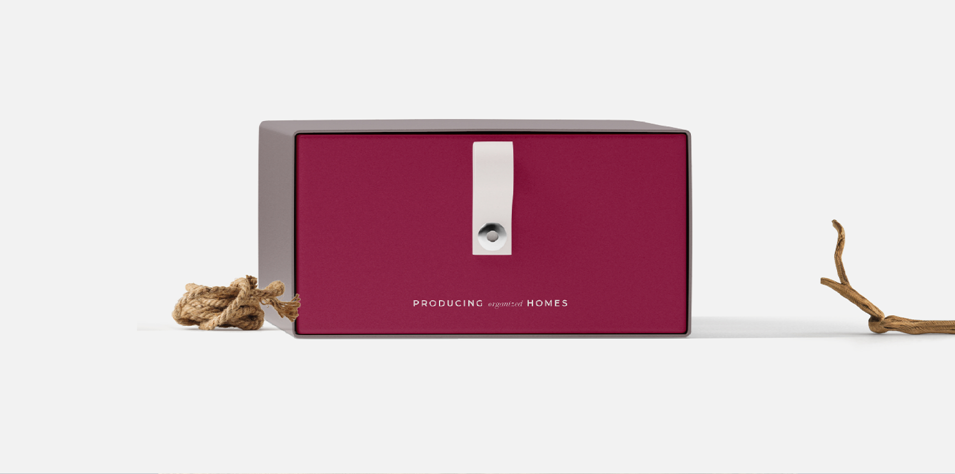
A powerful, memorable brand identity that says: “We help turn your house into a warm, neat, and welcoming space.”
TESTIMONIAL
“She went to every length to ensure we would be thrilled”
“When Malky sent us our logo choices, we were spoilt for choice and simply could not decide. All three were absolute masterpieces in every way, capturing our brand most perfectly. She seriously nailed our look. With her signature modern and unique touch, everything she touched figuratively turned to gold. Not only that, but she over-delivered in every way, giving us more than agreed upon, simply because she truly wanted our success. She went to every length to ensure that we would be thrilled.
Working with her has been nothing short of a delight because her flexibility and professionalism made for a seamless working relationship. If you want your brand to stand out in a classy but memorable way, use Malky.”
— Ari Herskowitz, TYH Group

